Will International Enrollments Crumble Under Trump 2.0? What Every University Should Know.
If you get enough international recruiters, enrollment managers, and admissions folk around the proverbial campfire – Trump 2.0 heats up quickly in the discussion.
And it should. As an industry still healing from the layoffs and cuts from COVID, uncertainty might be the longest 4-letter word in our biz.
But lets get one thing clear: This is not a political piece. This is not some soapbox moment. It’s a data-driven deep dive meant to help our subscribers navigate some uncertain waters.
Today, we’re looking back at Trump 1.0 to pull out some real insights which could have transformed your enrollment game – if we’d have leaned on data rather than the sensational headlines of the day.
And we’re paying that forward to Trump 2.0 and all the new uncertainties abound.
Here at Enrollment Charts, Data is King.
Forget gut feelings and the chatter from conferences or over casual drinks—here, we rely solely on cold, hard numbers. No bias, no fluff. Just pure, chart-driven insights.
Trump 1.0
Growing up, my paternal grandmother held one unbreakable rule in her house: no discussion of politics or sports at the dinner table.
Perhaps it is that rule which made me feel hesitant to write this. Almost certain this article holds the potential to irritate at least one reader, & that’s not my MO. So, please read forward and understand I am looking at the data here, and data alone.
Here’s a key fact: correlating student enrollments with presidential terms isn’t as straightforward as it seems.
Since presidents take office in January and enrollment numbers are reported in the fall, the effects of their policies don’t align neatly with their inauguration dates.
For example, although Trump was inaugurated on January 20, 2017, I attribute that fall's enrollment data to Obama—his policies still had a lingering influence as he was in office as the fall class came in.
Similarly, I credit the 2020/2021 data to Trump, even though Biden took office on January 20, 2021. Complaints aside, this method offers the most balanced view.
And in all fairness, Obama isn’t associated with the 2008/2009 figures since he only took office on January 20, 2009.
Enough with the house cleaning. Let’s get into some data.
International Enrollments: A Closer Look
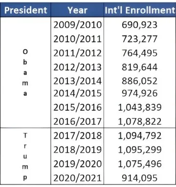
Let’s break down the numbers: Here are the total international enrollments in the United States as reported by Open Doors, grouped by president.
At a quick glimpse, international enrollments were gangbusters under Obama and lackluster in the last two years of Trump’s first presidency. Perhaps surprisingly for some, international enrollments increased the first two years of Trump’s first presidency.
Even under the shadow of the Muslim ban and the extreme visa vetting introduced in 2017, absolute enrollment numbers kept climbing amidst all the executive orders and headlines.
Now, here’s the elephant in the room: some might assume that the dip in 2019/2020 enrollments was driven by COVID. But that can’t be the case—remember, the first reported COVID case emerged in December 2019, well after the fall enrollment numbers were locked in.
Hence, absolute international enrollments in the United States did indeed top out under Trump, and not COVID. But, COVID definitely worked its black magic and pushed enrollments down to a 7 year low.
Looking Under the Hood
Why do I keep saying “absolute” international enrollments? What does that even mean? it means the total headcount—nothing fancy, just raw numbers.
While most folks stop at the surface, here at Enrollment Charts we peel back the window drapings to reveal what’s really happening under the hood.
Brace yourself—what you’re about to see might just surprise you.
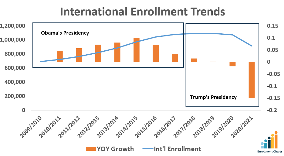
There’s a lot going on here – so let’s break it down.
Breaking Down the Chart
The Two Boxes: The chart is split into two sections—one box on the left covers the Obama years, and the box on the right frames the Trump years
The Blue Line: This represents the absolute number of international enrollments in the USA.. Its values are measured with the Y axis on the left side of the chart.
The Orange Bars: These bars capture the Year-over-Year (YOY) growth. In simple terms, they show how much the enrollment numbers changed compared to the previous year, calculated as (current year – previous year) divided by the previous year. The measurement for the orange bars appears on the Y axis on the right margin of the chart.
By combining these elements, we get a lot: you see both the big-picture enrollment numbers and the rate at which they’re changing.
The Rug Pull: Unmasking the Rate of Change
Here’s the twist: The YOY Growth or Rate of Change didn’t top out under Trump. It hit its zenith under Obama in 2014/2015. Those numbers went into decline the following year and continued that slope throughout the end of Obama’s presidency.
The Rate of Change eventually dipped into negative numbers under Trump in 2019/2020. But, the writing was indeed on the wall well in advance.
Markets like China were getting saturated. US Tuition Costs were on a relentless climb. Meanwhile, competing markets like the UK, Canada and Australia were busily stepping up their game.
All during Obama’s second term.
Now, don’t get me wrong - Trump’s policies definitely added fuel to the fire. In fact, when you look at the absolute values – it’s clear they did.
But imagine if, between 2015 and 2017, you had advised senior leadership that expanding your market presence might not be the wisest long-term move. You’d have been the rockstar of the boardroom—possibly in a cushy promotion by now.
This is why data works at telling stories without bias. No matter where you stand politically, it’s rare to hear universities claim that the decline in international enrollments began under Obama.
Bias is messy. Def not how we roll around here.
So, You Want Me to Quit Recruiting Because The Rate of Change is in Decline?
Now – this might be the best takeaway of the blog.
Helping our institution to not lose money or overspend is sometimes indeed the best strategy.
Ted & I talk about this a lot. There are two ways to build value for your school. Increase Revenue and Reduce Costs. Sometimes – these are performed in tandem. Other times, one strategy is best.
That said, if your recruiters need to hit the road to prove their worth, then partnering with Enrollment Charts might just be your ace in the hole.
The Big Takeaway
Here’s the game-changer: while the overall YOY Growth was in decline, our data unearthed four markets—Ghana, Cambodia, Uganda, and Peru—that defied the trend by hitting new highs from 2017 to 2020.
Imagine if your institution had pivoted with us at that critical juncture—you would definitely have been added to several leaders’ speed dial, to say the least.
This kind of insight is at the core of what our monthly visa issuance calls deliver. If you’re ready to be on the cutting edge and capitalize on these trends, now’s the time to reach out and join us.
In Conclusion
There is no crystal ball here. No clear knowledge as to what we can expect for specific markets over the next four years. Just as no one would have been able to predict in 2017 that Uganda, Cambodia, Peru and Ghana would defy the larger trends of international enrollment and do something spectacular.
So, instead – we keep an eye on the data. The facts as they present themselves.
The noise. The headlines. The fear. These are for the proverbial campfire. That next drink with a successful counterpart. The sidebar conversations at conferences.
That’s not us.
That’s not Enrollment Charts.
Instead – we accept that headlines will happen. Noise will suck the oxygen out of some rooms. And peers might find it incredibly difficult to remain objective.
So, let Enrollment Charts help. Let’s go big on data and leave the proverbial campfires for S’mores.
Data is king,
Jay Ligon
Ready to become a client and join the Enrollment Charts community? Click the link below.


